Comparing New Mahjong Cards to the NMJL Standard
With the recent introduction of new mahjong cards, we’ve tried most of them — with the exception of The Mahjong Press. And while I was initially skeptical of tile brands creating their own cards, I’ve come to understand that sometimes my brain just wants a different kind of challenge.
We’re not here to litigate whether these cards should exist. As of this writing, the National Mahjong League (NMJL) card remains the standard for teaching, tournaments, and leagues — full stop. These newer cards aren’t replacing it, but they may complement it.
What we do want to talk about is quality, design, and playability — and which cards we find ourselves wanting to come back to again and again.
Card Quality & Durability
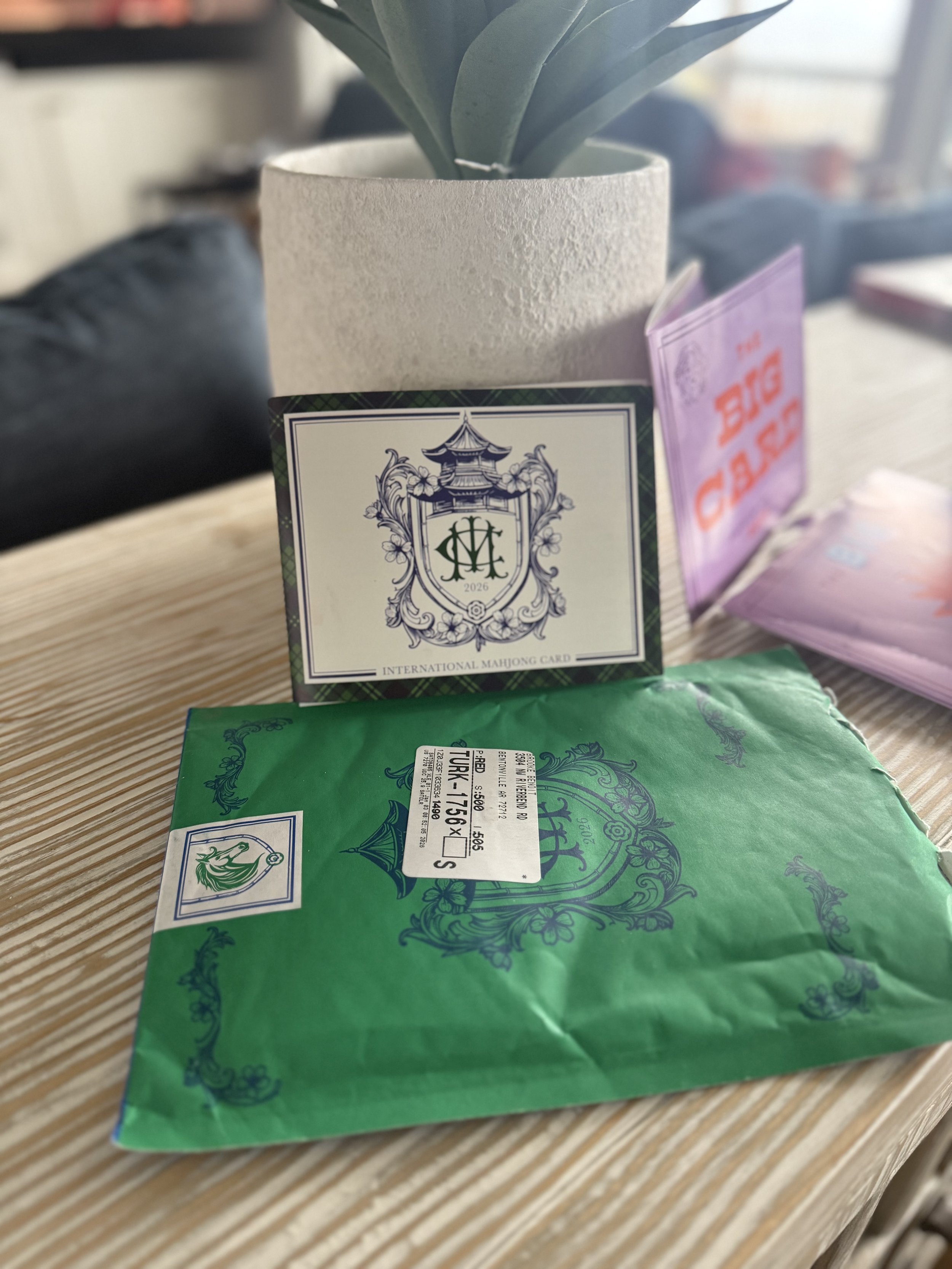
International Mahjong Card
The first word that came to mind when I opened this card was flimsy. It reminds me of the paper stock you’d choose for a brochure that needs to look nice on a display — but isn’t meant to last.
While most people only use a card for a year, I honestly don’t know if this one would make it that long without needing a replacement. It’s slightly nicer than standard paper, but not by much. Unfortunately, I opened the package in my bathroom, and it already has a smudge on the white cover.
That alone doesn’t inspire confidence.
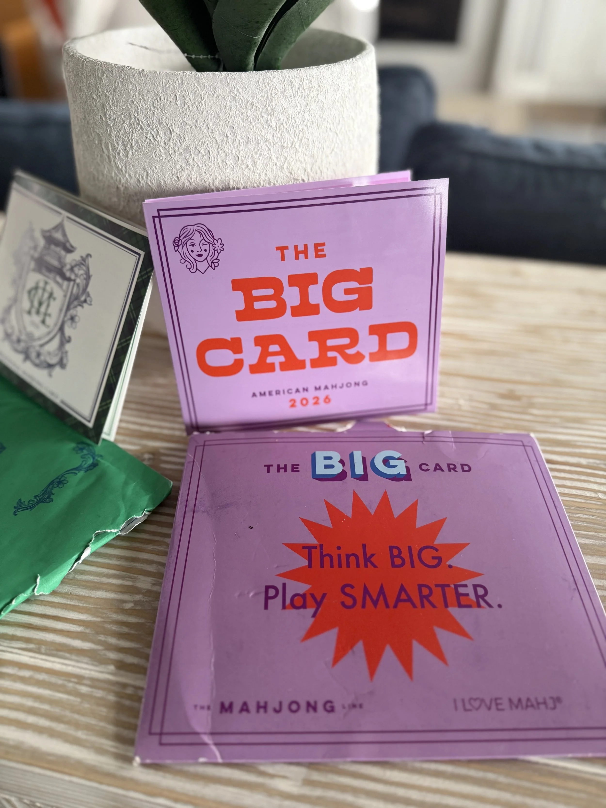
The Big Card
My first word here was sturdy. The NMJL card is made from a heavy cardstock, and this feels very similar in weight and structure.
The coating gives it a smooth finish that feels durable and — importantly — wipeable. I haven’t stress-tested the “waterproof” claim yet, but I wouldn’t hesitate to play with this at a table with drinks.
Siamese Mah Jongg League
The word that comes to mind here is familiar. This card feels the closest to the NMJL card in hand, though it has a matte finish instead of a slight sheen.
It feels like it will hold up well over time and repeated use.
Winner (vs. NMJL): The Big Card
It’s simply the best-built card of the bunch and feels like it can handle real-world play.
Card Design
I’m breaking this into two parts: the overall aesthetic of the card, and then the layout of the hands. First, design.
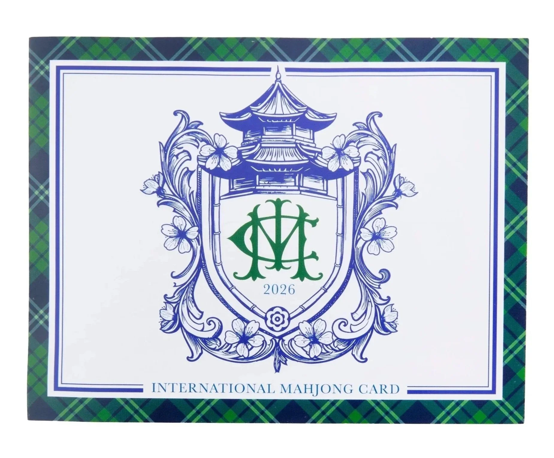
International Mahjong Card
Like most things from Oh My Mahjong, this card is beautiful. The green-and-blue plaid, the pagoda, the crest-like graphic — it’s polished and intentional. When it was first teased, many people thought it might be a collaboration with Ralph Lauren, and honestly… I get it.
Inside, the design stays consistent: clean lines, solids, stripes, and outlines that feel a bit like a men’s tie. It reads as a card meant to be used across brands rather than tied to a single tile line.
The Big Card
We’re big fans of purple at Mockingbird & Magnolia (it’s our signature color) so the light and dark purple border works for us. Where I struggle is the bold pop of red on the front.
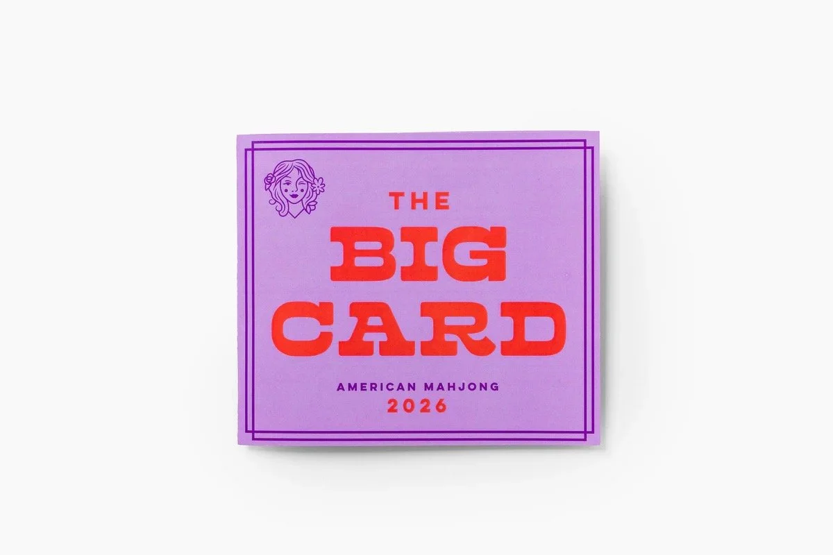
That said, this mirrors how I often feel about The Mahjong Line tiles themselves: I usually like something about them, but can’t quite articulate what doesn’t fully click. The front of this card gives me that same feeling.
Inside, though, the red works much better. It clearly signals a change in suit alongside the blues, and I always appreciate The Mahjong Line’s preference for visual cues over excess text. It adds clarity and visual interest.
Siamese Mah Jongg League
“Chaotically cute” is the phrase that comes to mind.
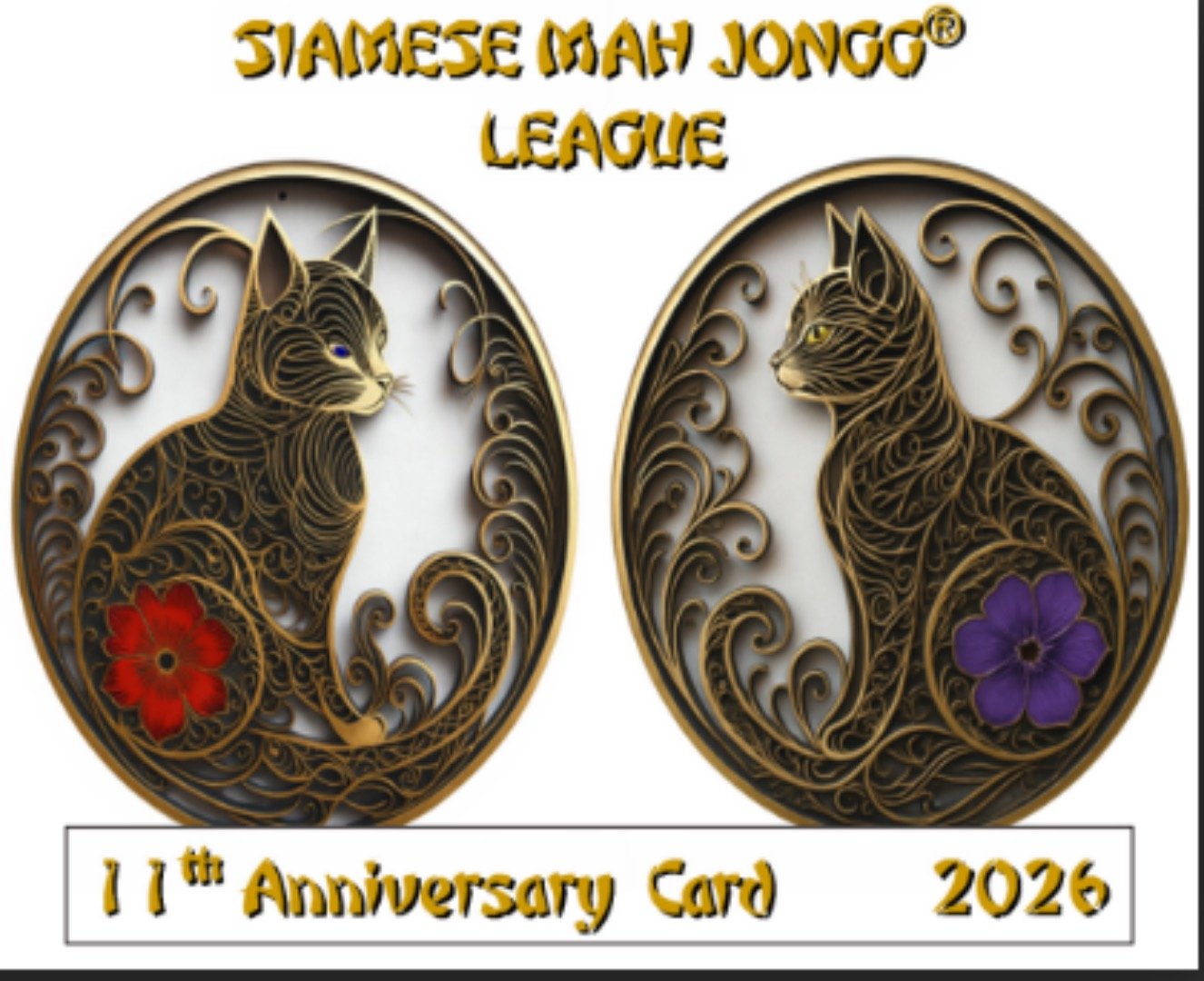
This is the first card where the font on the front becomes a challenge. While it appears to mimic the stroke of Chinese characters, it doesn’t read cleanly at a glance. The cute factor comes from the two cats on the front, styled like iron-on patches — a fun nod to the name and theme.
Inside, the layout largely mirrors the NMJL card, with one notable difference: the use of clip art. Various sections are highlighted with images (mostly cats), but there doesn’t seem to be a consistent reason for why specific images appear where they do — with the exception of the horse for the Year of the Horse.
Winner (vs. NMJL): International Mahjong Card
Purely on aesthetics, this one wins. It’s visually stunning and the most polished from a design standpoint.
Card Layout & Playability
International Mahjong Card
While the overall look is lovely, the layout is less intuitive. The structure closely follows the NMJL card, but along with adding line numbers adds Oh My Mahjong’s signature dot next to each line.
Aesthetically, the light blues and outlines are nice. From a playability standpoint, though, the combination of underlining, dots, and subtle color cues requires extra mental processing. I find myself stopping to think about what each visual element means — and the instructions for “these numbers only” are buried at the bottom of the page.
The Big Card
This is where the card truly shines.
Where the exterior jars me a bit, the interior is calm, clear, and beautifully organized. There’s very little unnecessary text. The use of tables separates hands cleanly. Section headers are left-justified. The numbered lines have subtle shading that makes them easy to track without competing visually with the hand itself.
I immediately wanted to play this card — not because of novelty, but because it looked approachable.
Siamese Mah Jongg League
This card again closely mirrors the NMJL layout, but eliminates the “X” and “C” entirely since all hands can be played open or closed.
It also introduces purple in the layout, though it isn’t immediately clear why. In some lines, the “any one suit” is black; in others, it’s purple. Given prior discussions around accessibility, it’s worth noting that purple is not a color-blind–friendly choice for many players.
Winner (vs. NMJL): The Big Card
It’s not even close. If these tile companies truly attempted to modernize the NMJL format in partnership before embarking on their own, this is the execution that gets it right.
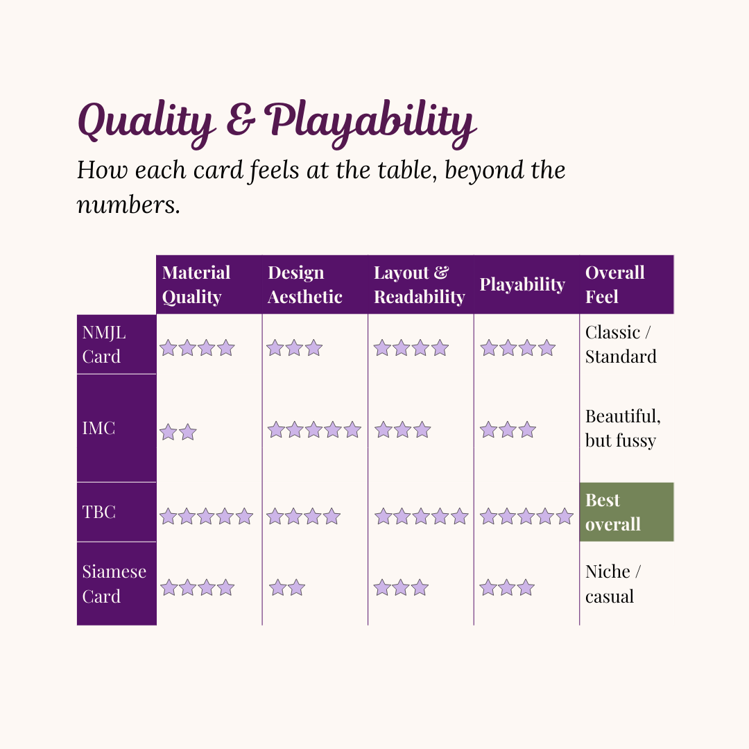
Scorecard for Quality & Playability
There is room for all these cards at the table, but in our opinion, quality and playability goes to The Big Card.
A Note on Shipping & Cost
Sydney received the Siamese Mah Jongg League card, while I had the others shipped to my house. Shipping costs were a major point of discussion during “card gate,” so it’s worth addressing.
Oh My Mahjong cited UPS tracking as a reason for higher shipping costs (around $10), especially compared to the NMJL card. However, The Big Card also included tracking via USPS — and shipping to Arkansas was $6.
I received tracking notifications for both and an alert via email and Shop when they arrived.
The Big Card arrived in a cardboard mailer. The International Mahjong Card came in a padded envelope. Given the cost difference — $12 for the IMC versus $10 for TBC — the quality disparity is noticeable. After tax and shipping, four IMC cards came out to about $65, while four Big Cards were closer to $50.
The Siamese Mah Jongg League card is priced at $9 and includes free shipping, which is certainly appealing from a cost perspective. However, unlike the other cards mentioned, it does not advertise that any portion of proceeds benefits a charitable organization. That may or may not factor into a purchasing decision, but it’s worth noting for players who value that aspect of the NMJL card.
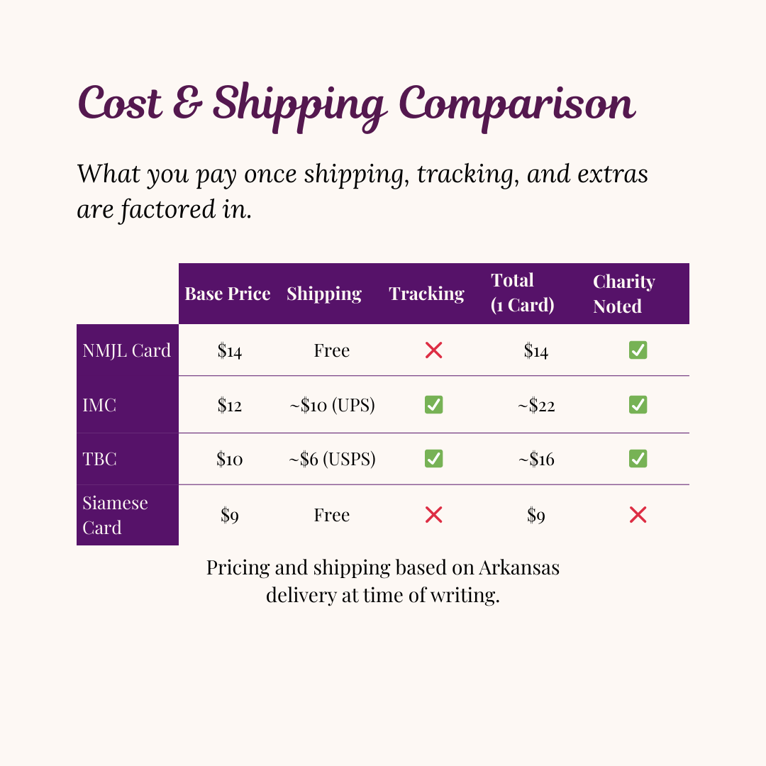
Given that mahjong is already an expensive hobby, additional cards are an investment.
If you can only buy one card: buy the NMJL card.
If you can buy two: buy the NMJL card and The Big Card.
That’s the one we’ll be reaching for when our brain needs (another) new challenge.